Double Page Spread Research

This double-page spread is not a pop music magazine, but I wanted to have different music magazines to see their different designs etc. This double page spread is plain and simple; it looks very sophisticated with the one main image, simple colour scheme and neat and tidy columns. All of the text is on the left page - this is easy to look at and makes the whole interview look professional. This page wouldn't have a masthead as it does not need one because it is clear what it is; the writing that would be under the masthead is at the top of the page having 'Dizzee Rascal' in red - telling the reader a little bit about who they are interviewing. The text is in columns, it is not very clear to see but only because this is a picture - for the double page the text is of good size, good layout and an appropriate font. All of the writing is in black - sticking to a simple colour scheme, the only writing that is in red is the name of the artist. The only text on the right is next to the image - this is a quote of Dizzee Rascal, something that he said during the interview. The main image is of the celebrity the magazine is interview - Dizzee Rascal. He is wearing a smart white jacket, a purple shirt and a black tie - this is a very professional sophisticated outfit. He is leaning his head backwards whilst doing up a button on his jacket with a cheeky grin. This image tries to show what his attitude is like - with an 'expensive looking' smart suite and a small grin on his face he seems smart, sarcastic and successful - this is clearly what the interview is about. The location of the image would most likely be a white screen for a photo shoot - this is then easy to manipulate photographs. The only other image on this double page is the small photograph of 'his friend' in the middle of some text in the interview - this is more of a personal picture for the artist, not an image edited for the magazine. Overall, this double page spread is very professional and 'smart', the columns make the text look very organised and gives the page a good layout.

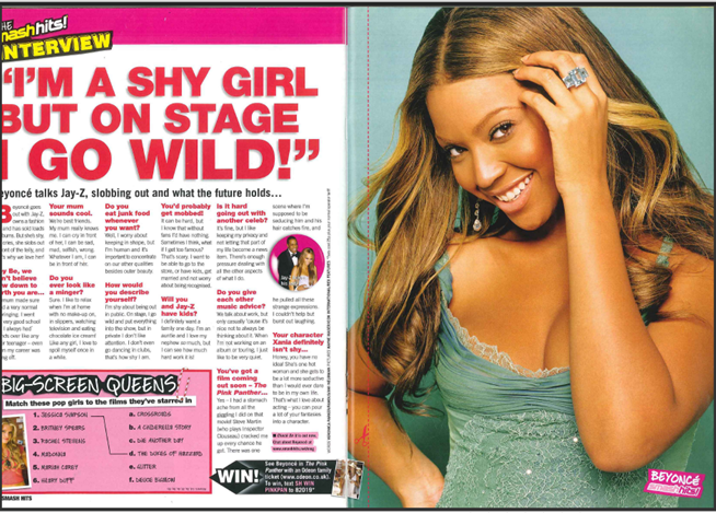
This double - page spread is a great example of a pop magazine - the pictures, the pink, the question and answer form interview and the main image. The artist Beyonce is standing with her right hand in her hip, slightly tilting, holding her hair out of her face, looking directly at the camera. She is wearing very feminine clothes - glittery/sequin low cut top. This image tries to show a bit about the celebrity - she seems girlie and innocent, but looking deeper into it she is trying to be quite seductive. This image doesn't particularly have a location, you could use you imagination to where it could be but most pictures like this have been taken at a photo shoot deliberately for this magazine in front of a screen (at least a plain background where it is easy to manipulate the colour). The masthead of this double page would be the quite that Beyonce is saying 'I'm a shy girl but on stage I go wild!'; this is used as a masthead to show you what the interview is about. The name of the magazine 'SMASH HITS' is on the top left corner of the page followed by 'INTERVIEW' showing clearly what it is - magazines sometimes do this as is looks as though it says 'smash hits is having an interview with Beyonce'. The style of the writing is in question and answer form like most pop music magazines. This is all done very informally, this then lets the celebrity show a bit about their personality and what they are like, instead of somebody editing their words. The majority of the text is on the left page showing order and form - this looks very professional and leaves the other page for a big image of the celebrity they are interviewing. The colour scheme of this double-page spread is a mirror of the front cover, it has stuck to 3 main colours - pink, white and black (with the image having a green scheme). Pop music magazines are always very bright and colourful - just from knowing this you can tell what genre of music this magazine is for. Overall, this magazine is a really good example of a pop magazine - it's informal, colourful and modern.

This double page spread is not a pop magazine - it is for 'Q' magazine. It is plain and simple but effective. The simple colour scheme of red, white and black match the front covers colour scheme. The red writing near the 'masthead' of double page spread reflects off the red shirt worn by the artist. The two main things that catches the eye of the reader would be the image and the quote from the artist. The main image is 'Lily Allen' - the main cover story. She has very dark hair (if not black), wearing a red tartan shirt with a gold necklace. The clothes of the artist colour coordinate with this magazines general colour scheme - red, black and white. The image does not have a background - it was most likely taken at a photo shoot deliberately for this interview in front of a plain white background (screen). The text on this double page spread is very modern - the language and fonts. 'people think I'm an attention seeker, but I'm just honest '; this is the first thing that catches the eye so it has to be interesting - this it it; this is a quite said by the artist the magazine is interviewing - this short blunt comment already shoes us a bit about her personality. The layout of the magazine is also simple but effective, the image takes up the majority of the right page and the quite of the artist takes up the majority of the left page - the actual interview is very small but I think it goes onto another page. This double page spread is just an example of one for a magazine - not particularly for a pop music magazine; I wanted to have another example of one to compare the different genres.
My Magazine Double - Page Spread
Images

This is the main image of the artist that I am using for my double page spread. This is the original photograph I took - I have the version where the background is cut out and the picture id edited (lighting etc.) - this shall be used on the magazine.
Steps

Step 2


This is my double page spread, however, I do want to make a few changes. I have got the colour scheme of the front cover but there are a few things that need changing - the border of the images are all pink so I need to make them 'match' the colour scheme. Another thing that I want to change would be the text 'Caiti May' - here I have the writing in capitals which is not necessary as the masthead is not in capitals so it just looks random. I also want the text to match with the masthead - same colour and font.

This is my final version of my double page spread; here will all of the changes made. The text and image borders on the page has been changed to suit the colour scheme; the text 'Caiti May' has also been changed to match the mastheads colour and font and another adjustment I have made is the alignment of that text in the top left corner - there was no need to it to be slanted.